Your cart is currently empty!
Welcome!
This page provides the official Calorica brand assets and usage guidelines. Please use these resources to represent Calorica correctly and consistently.
Logo
Our logo is the most visible part of the Calorica brand. Please use the official versions only.

Logo Guidelines
- ✅ Use the logo as provided — do not edit, crop, or distort it.
- ✅ Maintain enough clear space around the logo (at least the height of the “C”).
- ✅ Use the correct version for light or dark backgrounds.
- ❌ Do not change colors, apply gradients, or add effects.
- ❌ Do not place the logo on busy or hard-to-read backgrounds.
Colors
Calorica uses a clean and modern color palette to reflect health, clarity, and trust.
Primary Colors
- Purple bright #8b20ee
- Purple soft #f6ebfe
- Orange #ffbfad
- Yellow: #ffe2ad
- Green: #76fdb1
Usage
- Green is the main highlight color (buttons, icons).
- Pink is used sparingly for accents.
- White and dark gray are for backgrounds and text.
Typography
Our typeface keeps the brand simple and approachable.
- Headings & Titles: Poppins Bold
- Body Text: Poppins Regular
- Fallbacks: Arial, Helvetica, sans-serif
Please do not replace Calorica’s typefaces with other fonts when reproducing branded materials.
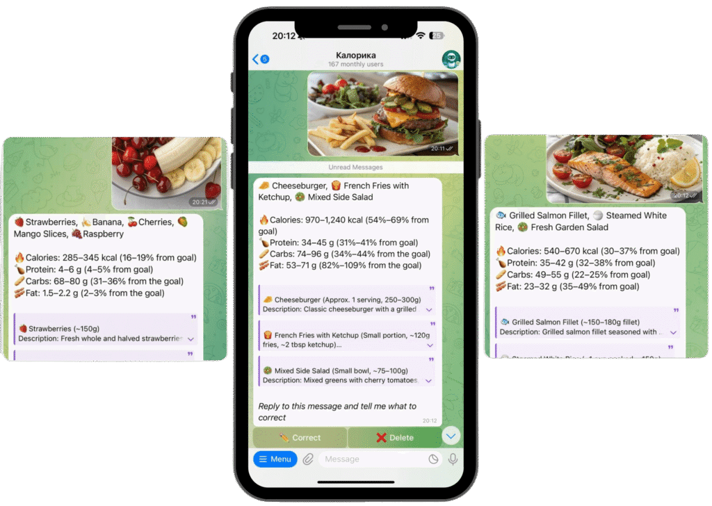
Screenshots & Product Media
We provide official screenshots and mockups for press and partners.


Guidelines:
- ✅ Use screenshots as provided.
- ✅ Show the interface in context (no cropping out branding).
- ❌ Do not add overlays, watermarks, or filters.
- ❌ Do not use outdated product versions.
Do’s and Don’ts
Do
- Use the official logo files.
- Follow color and spacing guidelines.
- Use assets for media, articles, partnerships, or integrations.
Don’t
- Modify the logo in any way.
- Use the brand in a misleading or harmful context.
- Claim partnership or endorsement without written approval.
Legal Notice
Do not alter, resell, or misuse our brand assets. Any usage must follow these guidelines.
Press & Media Contact
For press inquiries, partnership requests, or additional media files:
📩 Email: info@thecalorica.com
🌍 Website: https://thecalorica.com/
